
Using the picker
Once a pick starts (from the toolbar or the SDK), OpenPicker takes over the page with an isolated overlay. Here's the full flow.
Find an element
- Move your mouse — the element under the cursor is highlighted, with a small tag preview showing its tag and attributes.
- Click to select it. The click is captured, so links and buttons won't navigate or activate.
- Right-click or Esc cancels the pick at any time.
The sidebar inspector
After you select an element, the sidebar becomes an inspector:
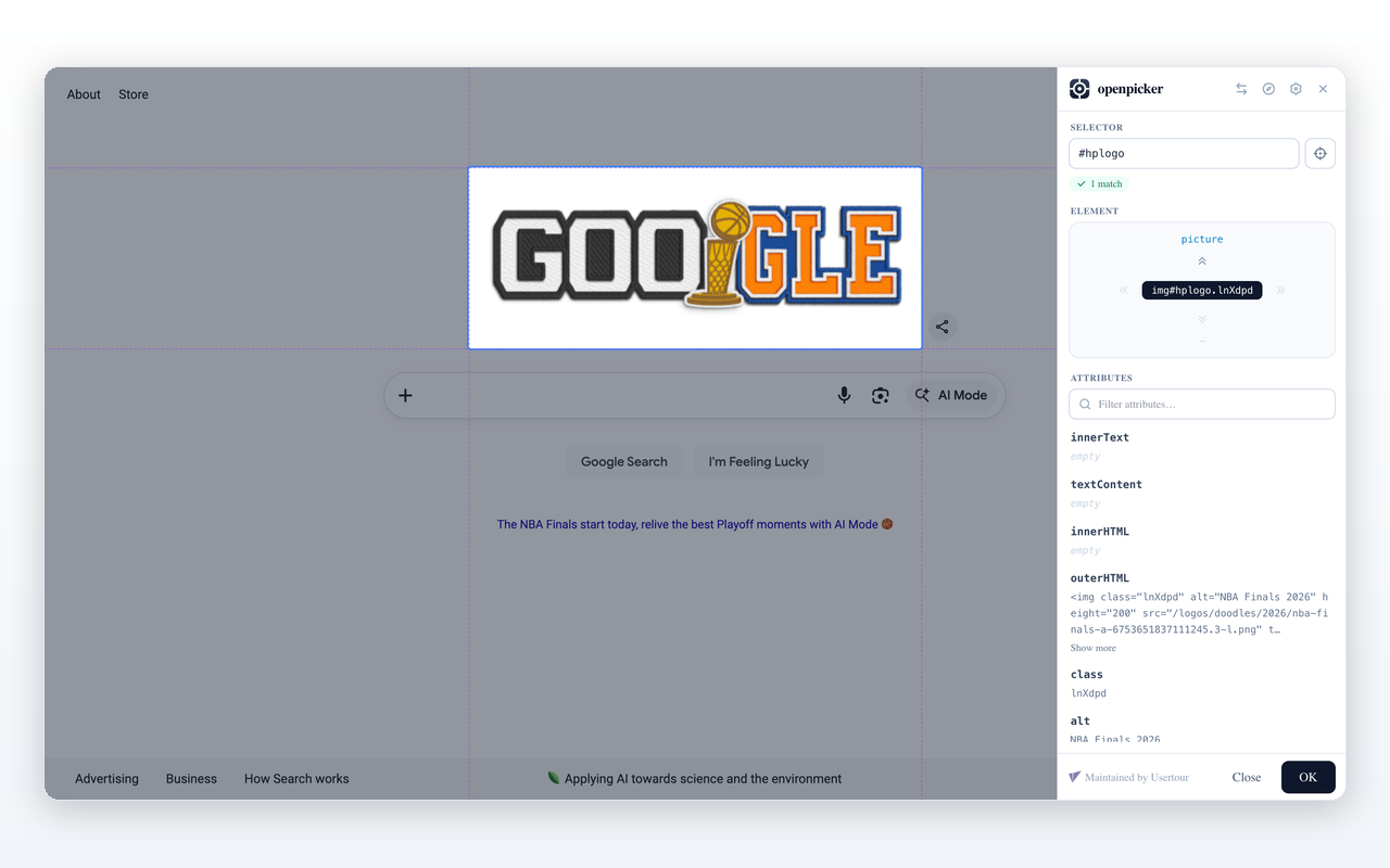
- Selector — the generated CSS selector. It's editable: type your own and the highlight, tree, and attributes follow what it matches. A pill below shows the match count (green when it matches exactly one element) or flags an invalid selector.
- Pick another element — the crosshair button returns to hover mode to choose a different one.
- Element — a DOM-tree navigator. The double-chevron arrows move the selection: up = parent, down = first child, left/right = previous/next sibling. Click the center chip to scroll the element into view.
- Attributes — a read-only list of the element's attributes and content (with a filter when there are many).
Confirm
- Toolbar pick — the confirm button reads Copy; clicking it copies the selector to your clipboard and closes the picker.
- SDK pick — the button reads OK; clicking it returns the result (selector, match count, element details, and an optional screenshot) to the calling app.
Navigate to another page
During a cross-tab (SDK) pick, the header has a compass button: Navigate to another page. Use it when the element you want is on a different page — the picker pauses, you browse freely, then Resume picking when you're there. The pick survives the navigation.
Swap side
The swap button moves the sidebar between the left and right edge, in case it covers something you need to click.
Screenshots
An SDK pick can request a screenshot of the selected element or the viewport; it's returned alongside the selector. See SDK reference.