
Configuring selectors
Different sites have different conventions — one relies on data-testid, another on stable ids or class names. OpenPicker lets you control how selectors are built, with a global default and per-site overrides.
You can set the rules in two places:
- the gear button in the picker sidebar (visible once an element is selected) — edits the current site's rules;
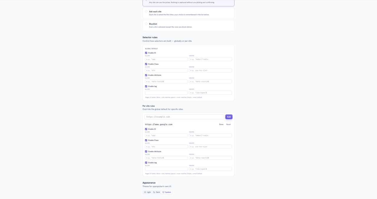
- the options page → Selector rules — set a global default and per-site overrides ahead of time, without starting a pick.
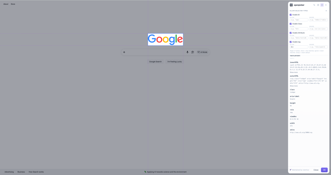
What you can control
Each anchor type — id, class, attribute, tag — can be enabled or disabled, and each has two regex filters:
| Field | What it does |
|---|---|
| Allow | Only names matching this regex may be used. Empty = OpenPicker's stable-name default. |
| Ignore | Names matching this regex are never used (applied on top of Allow). |
Examples:
- Only
data-stepattributes: enable Attribute, set its Allow to^data-step$, and disable id / class / tag. - Skip framework ids: id → Ignore
^ember|^radix-. - Skip hashed classes: class → Ignore
css-|sc-|jsx-.
For attributes, Allow / Ignore match the attribute name.
Built-in stability filters
When an Allow box is empty, OpenPicker uses a sensible default and automatically avoids anchors that won't survive a redeploy: auto-generated ids (Ember, Radix, React useId, long hex hashes), hashed class names (Emotion, styled-components, CSS modules), and it prefers test hooks (data-testid, data-cy, …) plus a curated set of stable attributes (name, aria-label, role, rel, href, word-like data-*). Your Allow / Ignore regexes layer on top.
Global default + per-site
The options page's Selector rules section has a global default (applies everywhere) and per-site overrides (for specific origins). The sidebar gear edits the current site's rules. Everything is stored in the browser, per origin — nothing is sent anywhere.
Controlling it from the SDK
An integration can pass selector rules into a pick, and optionally lock the UI so the user can't loosen them:
op.pick({
  url: "https://app.example.com",
  selector: {
    attr: { allow: "^data-step$" },
    id: { enabled: false },
    class: { enabled: false },
    tag: { enabled: false },
  },
  lockSelectorSettings: true, // gear read-only
  lockSelectorEdit: true, // selector field read-only
  requireUniqueMatch: true, // OK only when the selector matches exactly one element
})
SDK rules compose with the user's saved rules — each layer can only narrow (enable ANDs, ignore unions). The picker won't return a selector that violates the active rules: it offers a conforming selector or none (confirm is blocked, with a hint, when no conforming selector exists or the user hand-edits an off-rule one). Because the user can still hand-edit unless you set lockSelectorEdit, validate the returned selector with matchesSelectorConfig:
import { matchesSelectorConfig } from "@openpicker/sdk"

const cfg = { attr: { allow: "^data-step$" }, tag: { enabled: false } }
const { selector } = await op.pick({ url, selector: cfg })
if (!matchesSelectorConfig(selector, cfg)) {
  // doesn't meet your requirement — ask the user to pick again
}
Restricting which element can be picked (mustMatch)
Selector rules shape how a selector is built. A separate axis, mustMatch, controls which element can be picked at all — pass a CSS selector and only matching elements are selectable:
op.pick({ url, mustMatch: "input, textarea, select, [contenteditable]" })Hovering a descendant snaps to the nearest matching ancestor; elements with no match show a "can't select" cursor and ignore the click. The two axes are independent and compose — e.g. only inputs, identified by id:
op.pick({
  url,
  mustMatch: "input, textarea, select, [contenteditable]",
  selector: { class: { enabled: false }, attr: { enabled: false }, tag: { enabled: false } },
})
An invalid mustMatch rejects the pick with invalid_params.
See the SDK reference for the full parameter list.